Clear request flow
Service requests are designed to move from the website into a custom mobile workflow so the client can review the need, respond quickly and route it to the right person.

BurkeMedia Work
A home-service brand, website and request system built around trust, fast response, real people and practical customer communication.
Project overview
Handy Angels needed a digital presence that could quickly communicate what the company does, who is behind it and why homeowners, rentals and property managers can trust the team with urgent repairs and ongoing property care.
BurkeMedia helped shape the project across the full customer journey: logo and visual identity, website structure, service pages, real photography, inline video, printed brand pieces and a service request path that sends new requests into a custom app on the client's phone. From there, the request can be reviewed and shared with the right team member instead of getting buried in scattered texts or missed calls.
For a home-service business, the website should not only look credible. It should help the work move.
Brand identity
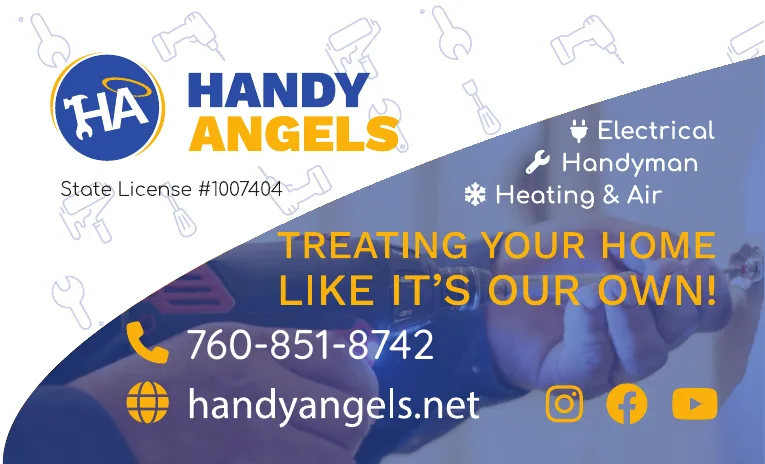
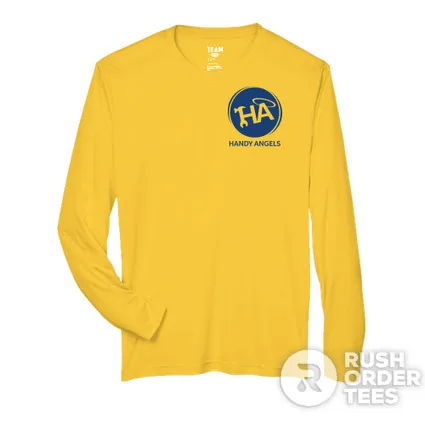
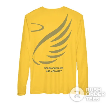
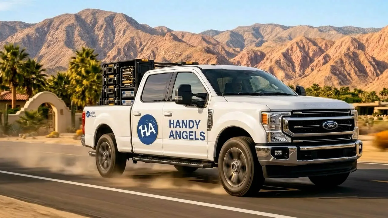
The Handy Angels brand needed to feel helpful without looking generic. The logo, blue-and-gold color direction and guardian-angel idea gave the business a visual system that can live on the website, shirts, cards, magnets, service vehicles and social content.
The line “Treating your home like it’s our own” became a useful trust signal because it connects the brand promise to what customers actually care about: response, care, communication and respect for their property.

Website experience
The Handy Angels site uses motion and real visuals to add energy while keeping the request path clear. The video helps the brand feel active, local and service-ready, while the page copy keeps customers moving toward the next step.
Service requests are designed to move from the website into a custom mobile workflow so the client can review the need, respond quickly and route it to the right person.
Team photos, service language, reviews, emergency messaging and local-area content help the site feel grounded in real people and real Coachella Valley service needs.
The service content supports search and AI-assisted discovery without sounding like placeholder text or keyword stuffing.
Printed and physical brand pieces
For service businesses, customers see the brand in multiple places: a card, a magnet, a shirt, a truck, a social post and the website. We kept those pieces connected so Handy Angels feels consistent wherever someone encounters it.

People-first content
Instead of leaning only on stock images, the project uses team and partner portraits to make the business feel personal, local and approachable.





Related story
We also wrote a project reflection about why the Handy Angels build connects branding, real content, service requests and local visibility.
Read the Handy Angels Blog PostVisit HandyAngels.netWebsite DevelopmentBranding & Graphic DesignCRM, Automation & ServiceUp Systems
Build the system around the business